Enterprise UX is tough.
Whether it’s convincing a C-Level that it is important because it helps to improve productivity and data quality, reduce training costs and process errors. Or breaking through silos to attain our best future state by converting those highly functional Enterprise Grade Applications into an expected Consumer Grade UX. SAP has made great strides to show you they are listening to their customers to improve UX. Products like Fiori and Personas are clear indications that SAP cares about UX.
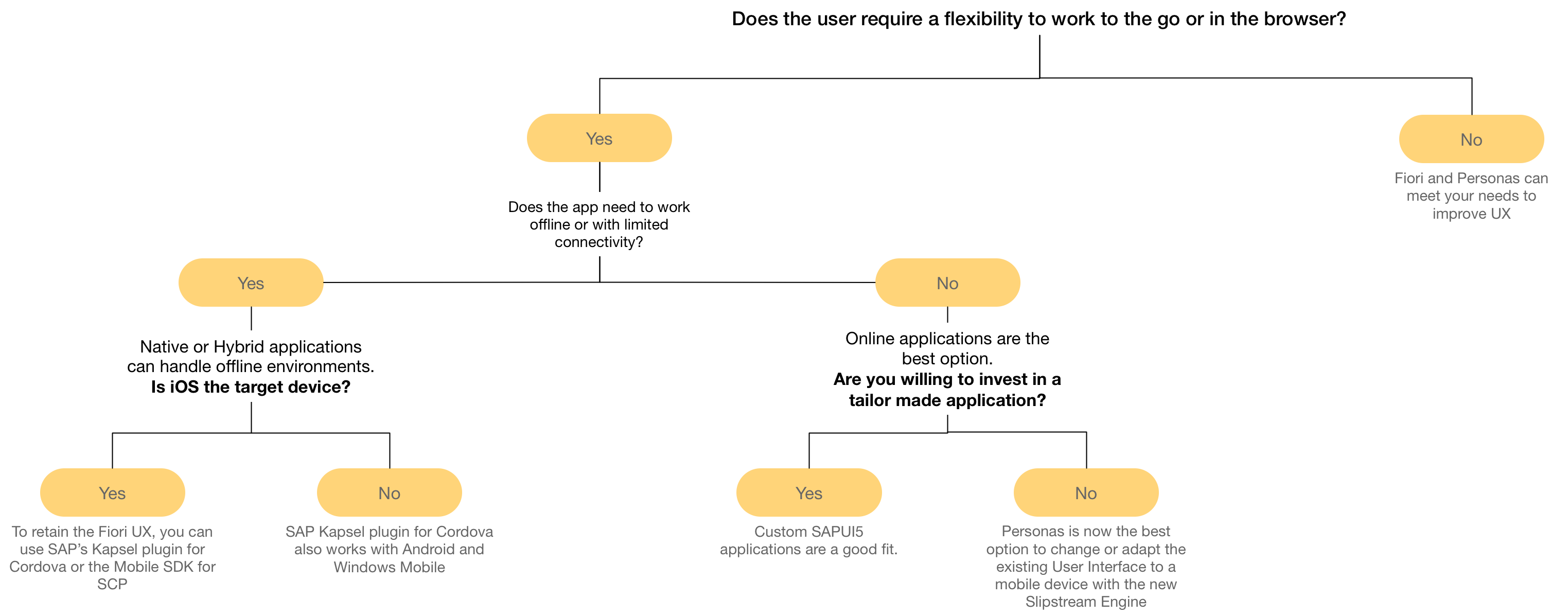
Improving UX should always start with Design Thinking. Forget about picking technology before you know what is being designed. That’s like picking out an engine for the car before you know what the car will be used for. You wouldn’t buy a V8 engine first when we’re trying to improve fuel economy. Sometimes we pollute the process when we don’t listen to the problem, discover who are we impacting, and identify the ideal state. You need those ingredients to shape how we design a solution and decide what technology fits the bill.
There are several products from SAP and third parties that can deliver an improved Enterprise UX. This blog only focuses on SAP’s products. Each has its strengths and weaknesses. So if you are selecting one, then hopefully this next bit will give you some insight:
Screen Personas is a great solution for getting existing transactions (or even custom programs if you like) and transform that stale SAP GUI UX, into the Fiori UX (or your own flavor). Now. as you can see SAP Screen Personas has transcended its original intent, which was to first personalize the SAP GUI without requiring custom development. Then it became apparent that exposing this tool to the browser was very desirable. SAP decided to use its Internet Transaction Server (ITS) which is used to convert SAP screen to HTML. ITS has one fault, and that is that it doesn’t work well on mobile devices. With the Slipstream Engine, Screen Personas is beginning to render on mobile devices, increasing the value proposition.
If you want to take the Slipstream Engine for a spin, you may want to check out @PeterSpielvogel’s blog about the openSAP Training System Now With the Slipstream Engine and taking the openSAP course Using SAP Screen Personas for Advanced Scenarios. Also, review SAP note 2551016 – Rendering Flavors on Mobile Devices
UPDATE: Keep in mind the screens following do not have additional Flavor customizations. I would expect there would be further refinement required to meet the needs of a mobile user’s unique use case.
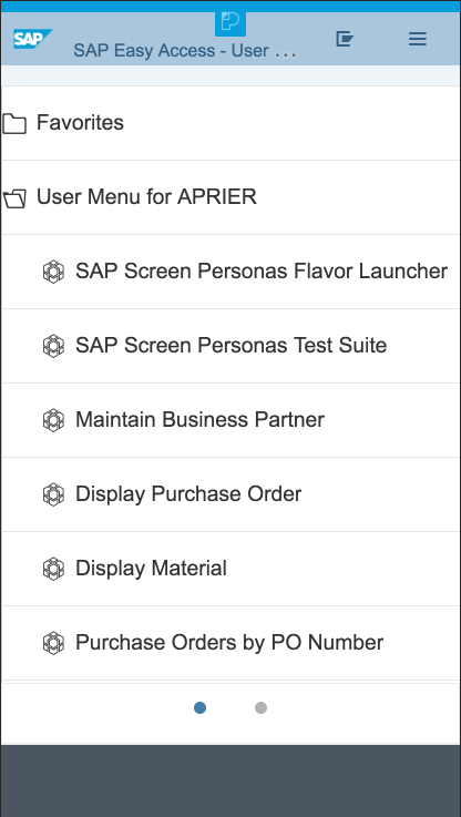
Here is the SMEN menu on a mobile view:
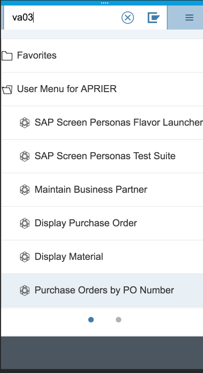
The VA* transactions were marked as being supported, so I tried out VA03:
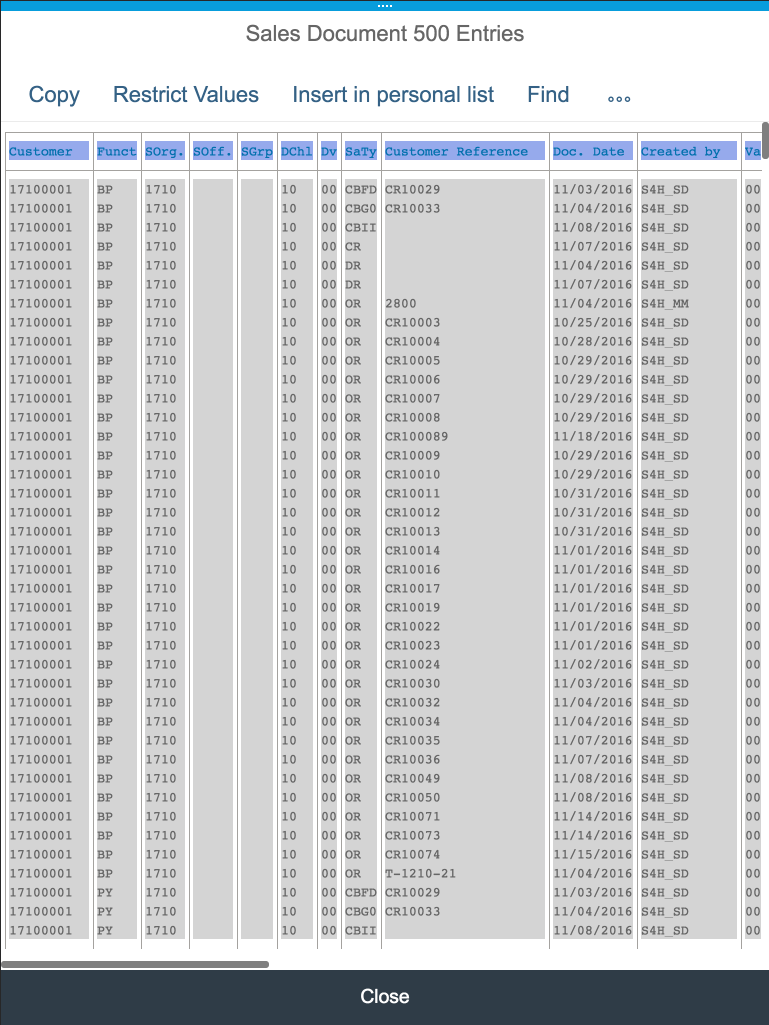
VA03 is quite busy, so I decided to switch to the iPad because the mobile view was a bit cramped, but you can still zoom if necessary. First I needed to get a Sales Order number to look at and I got the following screen. I’ll be honest, this screen confused me, because I kept tapping on a row, and nothing happened. It turns out you have to tap the item (row) you want, then tap “Copy”. This will copy it over to the order number field.
Voila! We have VA03 on our tablet.
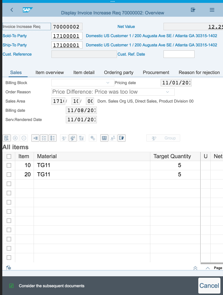
Changing the orientation reveals more of the screen. You can still zoom and scroll to find what you need if it isn’t in your view.
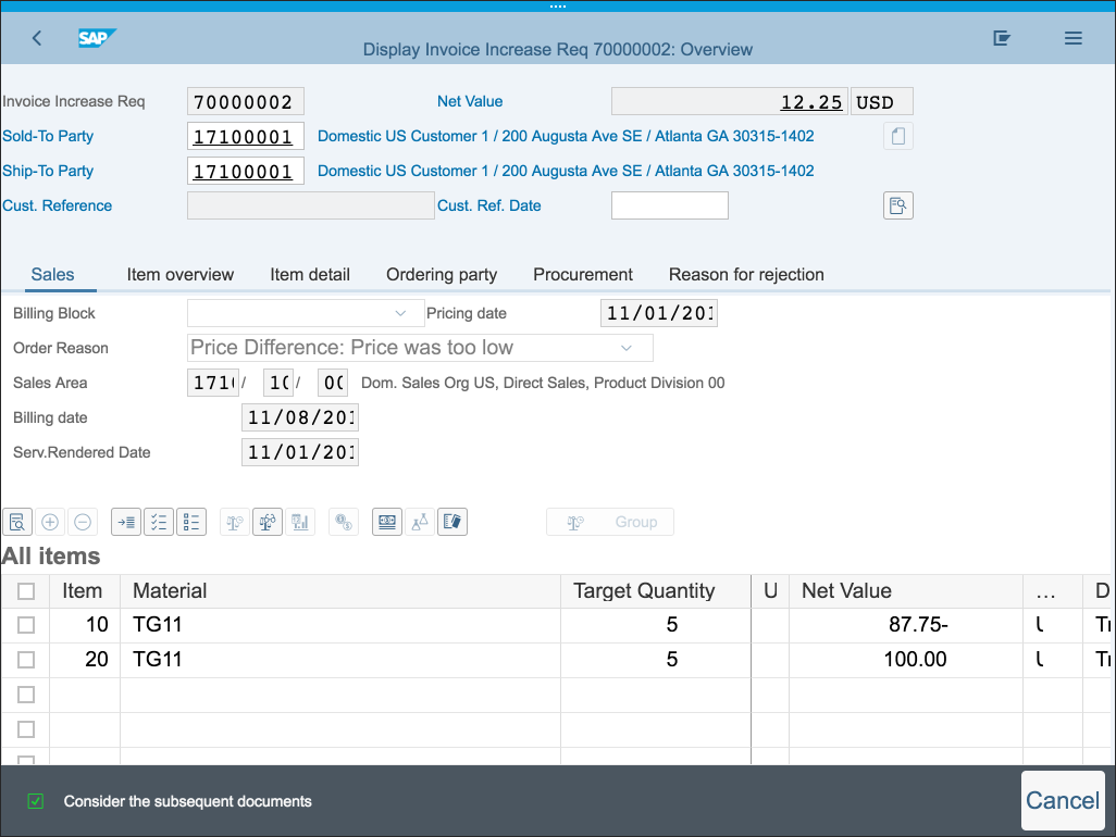
This was just a quick exploration, into what is happening with the Slipstream Engine. I was impressed at how these big VA03 screens were converted into a view reminiscent of a Fiori app. We are utilizing existing tried and true programs, and giving them a facelift to work on mobile devices. Meanwhile, this will begin to align legacy SAP screens to their UX Strategy. In reality, you would probably want to have a reduced set of objects on the screen for a real-life scenario. I think the value is apparent, there was nothing for me to do to change this screen. This was created for me as part of the Slipstream Engine, and I am sure there is more to come.
This was a great start, and I think a few features could make Screen Personas even better:
- Design Elements – Convert the SAP GUI controls to true SAPUI5 controls. This one is a tall order I am sure. This seemed like a great area for improvement. Especially the classical list. When selecting a row, it was never clear t confusing interaction.
- Scaling – Limit the horizontal scrolling. For example, The tabs for the different search help options were very wordy, so one tab could span the screen. Put these into an overflow toolbar so we could navigate to the correct tab.
- Offline/Caching – Another tall order, but sometimes 3G makes things take a long time.
- Launch Screen – Have SMEN work like the Fiori Launchpad. I really like the idea of tiles in my favorites and user menu. Maybe, even some scripting that allows me to populate numbers on the tiles.
What are your thoughts on SAP Screen Personas Slip Stream Engine? Leave a comment or email me at andy@mindsetconsulting.com.
If you are interested in viewing similar articles, visit our blog, here.
View our LinkedIn, here.
