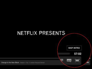
It’s 2AM, I’m 8 episodes into season two of Stranger Things, and I am showing no signs of stopping. I am, however, getting pretty tired of the intro. There’s definitely some great title sequences that really set the tone for the show, with amazing music and visuals. Game of Thrones, American Horror Story, and House of Cards all come to mind. But some of these intros clock in close to two minutes, and after the second or third episode, the tone is set just fine, thank you. That is why I was really psyched when Netflix introduced the “Skip Intro” button.

Image Source: Business Insider
As far as I’m concerned, the Netflix app already had a pretty great UX. If it’s simple enough that my parents can work it without calling me, suffice to say it’s probably a pretty usable interface. It just works. But even already great experiences often have room for improvement, even if it’s with features I didn’t even know I wanted. It was crazy how excited I was for this feature. The binge-watcher in me was psyched to get a few minutes back, but the designer in me was so pumped that someone at Netflix so well anticipated a need I didn’t even know I had, and solved it in one click.
In my work, all of my design and development work is for enterprise applications, so there are not a lot of parallels between the apps I work on and Netflix or Uber, but I think the “little bit goes a long way” philosophy still applies for a number of reasons.
- Enterprise UX is, in general, still pretty bad. Even minor improvements in the UX, especially for tasks users may do 10 or 20 times per day, can make a HUGE improvement. Recently, as part of a design workshop around timesheets, it was discovered that for half of the employees, they were really just entering “regular hours” for 8 hours, every day. Providing a one button click to copy a previous week’s tasks and hours now allows those employees to enter most of their time in one click. If you can make someone’s day even a little easier, your users will love you. Which brings me to my next point.
- Your users will love you. I have seen places where there is a somewhat contentious relationship between users and IT. Users think IT forces bad software on them, making their lives harder, and IT thinks the users don’t bother to learn how to use the powerful tools they are creating. After a recent design session focusing on field sales enablement, the sales folks said what an amazing experience the process was. Previously, they felt like the solution had been forced on them, and ended up having a pretty low adoption rate. Building new apps not only for the end users but with end users, made for a much more robust solution, that people are happy to use. Fostering collaboration, and making improvements based on users’ needs will make for a great relationship between the business and technology teams, only leading to improvements in morale and efficiency.

- Build a fanbase. In my line of work, consulting, it’s important that I add value for all of my clients, something I work hard to do every day. Sure, doing some big overhaul of a particular application or interface can lead to great results. However, sometimes it’s really just a matter of the right button in the right place. Or maybe figuring out a way to turn a 3 step process into a 1 step process. In either case, understanding the users and their day to day life in a way that allows me to anticipate their needs is important, and leads to truly great experiences.
At the end of the day, whether it’s consumer or enterprise applications, we should be striving to provide our users a great experience. We all expect our apps to “just work”, and those we use for business are certainly no different. But it doesn’t have to be complicated. Sometimes it just takes one button to make a fan, and save someone a few minutes every time they create a sales order, or, you know, watch an entire season of Mindhunter on a lazy Sunday.
View our LinkedIn, here.