The technology space is always filled with buzzwords. Some of today’s hot topics include AI, machine learning, IoT, blockchain, and many more. While some may pepper their articles and presentations with these terms, with little substance, they all are truly transformative technologies, that will change our daily lives over the next several years. And that change is not only taking place within the tools and apps we use at home, but at work as well.
I work primarily in the SAP space, and if you’re familiar with that area of technology, you probably have heard of Leonardo. This is SAP’s platform for digital transformation, offering services, accelerators, and connectors for AI, blockchain, and IoT, among others. It is an exciting time in the world of enterprise apps, as we work to transform the tools people use every day to complete their jobs. But even with all of the latest technologies available, the secret weapon to any good app or website, for the consumer or enterprise, is information architecture.

If you have not come across the term information architecture, or IA for short, it can be simply explained as how the data is organized. If you ask the Information Architecture Institute, they will tell you that IA is “the practice of deciding how to arrange the parts of something to be understandable.” The same way an architect will layout the plans to a building, with careful attention to the spaces they are creating, an information architect must layout the information contained in an app in a way that the user will be able to find what they need.
From recent design workshops, it is quite clear that many enterprise tools lack a quality IA. One complaint I heard recently while examining a tool that allows the user to lookup various employee data was “I don’t know what I don’t know.” This user, someone that used this tool infrequently, simply did not know what information was available, so she didn’t really see the value in what this tool provided. If you know SAP, then you won’t be surprised to learn that this particular transaction basically hides the information across all sorts of tabs and subareas, as many SAP transactions do.
Another common complaint is that similar data is scattered, causing users to constantly have to navigate back and forth, remembering what’s on each screen, or jotting down the info, just to do a comparison. Yet another issue is that enterprise apps can sometimes suffer from a labeling issue, often using complicated jargon instead of commonly used terms. This leads to confusion amongst users on what the data they’re seeing really is. Lastly, even something as simple as a search can cause problems. Enterprise tools like SAP offer a thousand different ways to search, sort, filter, and customize results when everyone today expects a Google-like experience anytime they want to search for things. And for this particular tool, everyone is simply searching by name, and using a few characteristics to narrow down their choice in the event of a common name.

The book “Information Architecture for the World Wide Web” talks about four main components in the area of IA. Those are organization systems, labeling systems, navigation systems, and searching systems. From the common complaints I get working directly with end users, it’s clear that enterprise applications often have issues in all of these areas. From my experience working with thousands of end users over the years, helping to reimagine and redesign their enterprise tools, here are three ways to help ensure your apps have a good IA.
1. Observe and Interview
End-user interaction is incredibly important in helping to determine what information is relevant to their particular job, and how they are using it to complete their tasks. Observations and interviews will help you to understand all of this clearly. Have a user walk you through the task you are looking to learn more about, maybe searching for employee information, or approving an invoice. Have them explain what they’re doing, and what they’re looking for as they go. Ask questions about how they’re making decisions or taking actions based on the information they see. Lastly, try to capture outside sources of information they may be using to help them with their task, and figure out how this can be built into the existing tool so the user doesn’t have to jump around.
2. Card Sorting
Card sorting is a technique that helps the design team understand how the user organizes the data for a particular site or application. To do this, write down the pieces of information the users need to complete their job on index cards or post-it notes. If you are using an open sorting technique, simply let the subject look over the data, and sort them into categories that they see fit. If you are using a closed sort, you will be providing the categories, and the subject will assign each bit of information to the predetermined categories. This will help the designers understand how the user organizes their data in a way that makes sense to them, which we can then design the app around. For more tips and tricks for card sorting, check out this article from usability.gov.

3. Take advantage of existing design best practices
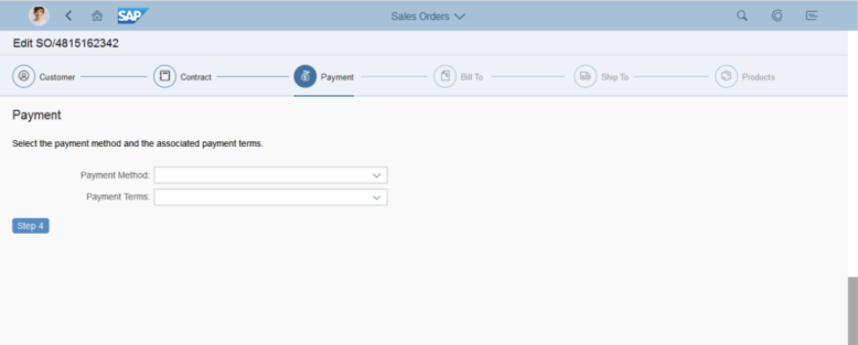
SAP has been working on creating, updating, and improving the Fiori user experience for several years now. Within these design guidelines are best practices on how to use various controls, screen elements, and floor plans to help create consistent, easy to use apps. For example, if you need to guide users through a step by step process, take advantage of the wizard floor plan as seen below.

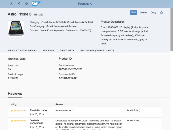
Or, perhaps we want to create a page that shows various categories of information, for something like employee or product data. In this case, the object floor plan provides us with a template to effectively categorize and organize our data and provides simple navigation between the various sections.

Applying these design guidelines, while paying attention to other aspects like proper labeling, will help ensure your app is easy to use, with users able to quickly find the information they are looking for.
With everyone focused on bringing innovative technologies into their app, and using popular buzzwords to sell their ideas, don’t forget that you do need to sweat the small stuff, which often may be the most important part of your applications. Big data doesn’t matter if your users can’t find that data. Intelligent insights surfaced by AI won’t matter if your user doesn’t know they exist, or how to find them. Even if you’re building a conversational UI, your users will have to know what to tell that interface to get the right information. So while you focus on the latest and greatest technologies, don’t forget that good information architecture is still the foundation of any good app.
If you are interested in viewing similar articles, visit our blog, here.
View our LinkedIn, here.